Choose what a point shows
A point can carry a lot at once, so choose by what someone needs to know from across the sheet. Give the most important fact the biggest part of the point, and leave the rest on the card.
The parts of a point
Section titled “The parts of a point”| Part | What it looks like | Best for |
|---|---|---|
| Color | The whole point | The one fact that matters most, usually status |
| Initials or icon | Inside the point | What kind of thing it is, like a model or a mark |
| Ring | A small ring inside the point | A second status, like an inspection result |
| Highlight | A highlighter glow outside the point | Something to find fast, one per card type |
| Corner flag | A disc at the point’s corner | A yes or no that needs attention; several can stack |
| Corner mark | A camera, paperclip or list disc at the corner | Showing that photos, files or tasks are there |
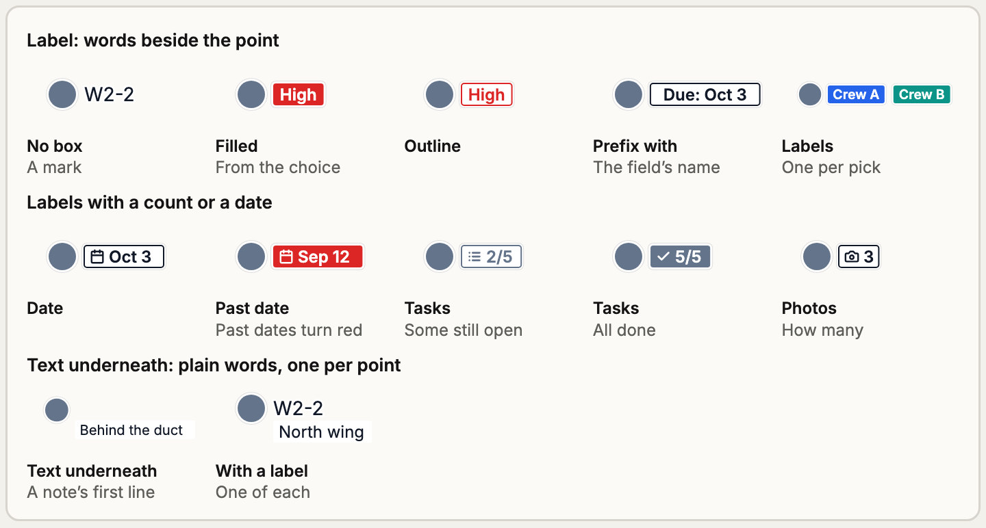
| Label | Words beside the point, usually boxed | A short value you need to read, like W2-2 or a date |
| Text underneath | Bare words under the point | A longer note or description |
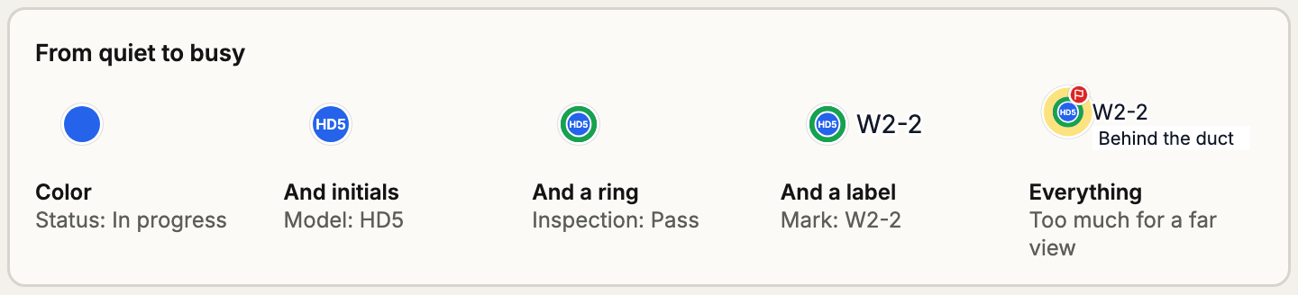
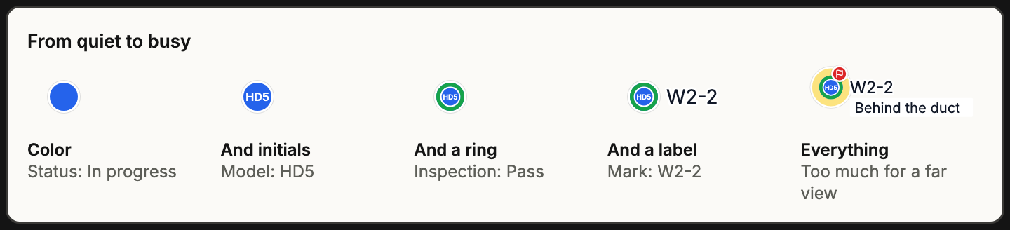
Examples of color and ring
Section titled “Examples of color and ring”Color is the first thing anyone sees, so use it for the fact that matters most. A ring adds a second fact without hiding the first.
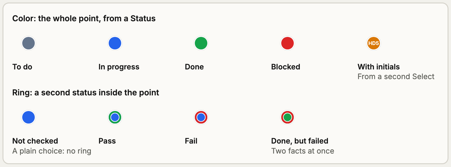
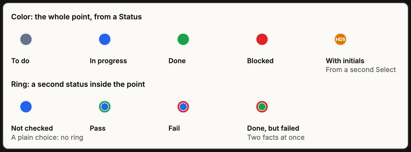
Where the settings are
Section titled “Where the settings are”In Setup, open a card type, then click a line of its card. On the plan has what that field does on this card type’s points:
- Show on the plan: off, and the field draws nothing. Its settings are kept for when you turn it back on.
- In the point: switches for Color and Initials or icon, which let the field’s answer replace that part.
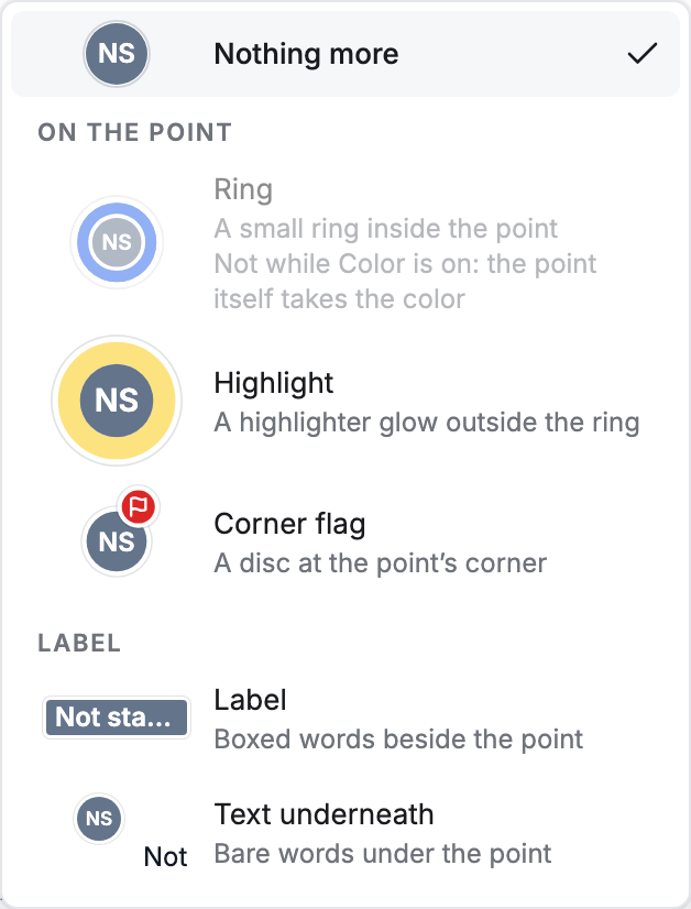
- Also shows as: Ring, Highlight or Corner flag, and Label or Text underneath.
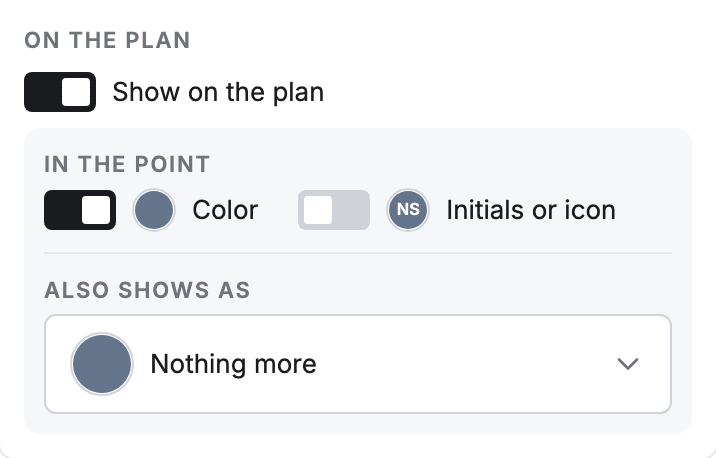
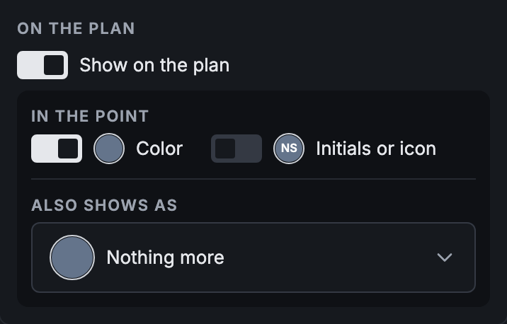
These apply only to this card type. Save them with the rest of the card type.
The card type’s own starting look, its Color and Initials or icon, is under Card type settings. Every point starts with that look, and fields change it from there.
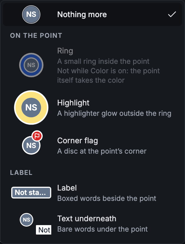
The Also shows as menu draws each place, so it works as a legend:
Choosing, by what you want to happen
Section titled “Choosing, by what you want to happen”| You want… | Do this |
|---|---|
| Every Issue to look the same, whatever its answers | Set the card type’s Color and Initials or icon; turn on no switches |
| The point to change color with its status | Turn on Color for that field |
| A second status without losing the first | Use Color for one field and Ring for the other, on two different fields |
| Hold-downs to show their model | Turn on Initials or icon for the model field, and give each choice initials or an icon |
| One or two answers to shout | Corner flag or Highlight on a Select, ticking only those choices |
| A manual “look at this” switch | A Flag field as a Corner flag or the Highlight |
| To see a value without opening the card | Label; turn on Prefix with when the value alone isn’t clear |
| Late work to stand out | A Date field as a Label, with Past dates turn red |
| To see at a glance if a point has photos | Photos as a Corner mark |
| Nothing on the plan, just the answer on the card | Turn Show on the plan off |
Flag, Corner flag and Highlight
Section titled “Flag, Corner flag and Highlight”These get mixed up, because “flag” means two things.
- A Flag field is a question: a yes or no that someone switches on.
- A Corner flag is a place on the point: the disc at its corner.
A Flag field usually shows as a Corner flag, but it can also be the Highlight or a Label. A one-pick Select can also use the Corner flag or Highlight, and then only the choices you tick show it. So Stop can raise a flag while OK raises nothing.
Use a Flag field when a person decides something needs attention. Use a Select when it follows from an answer they’re already giving: it saves asking twice, and the choice and the flag can’t disagree.
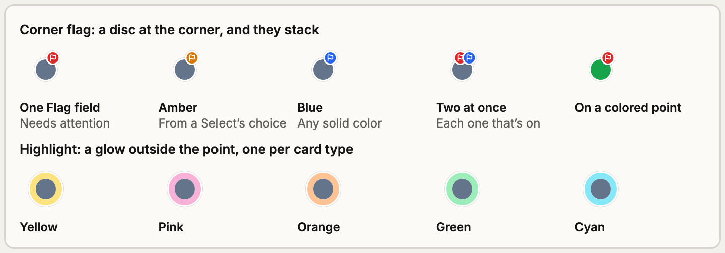
Choose Corner flag when several things might each need attention, because they stack. Choose Highlight for the one thing that should be easiest to find: a card type can have only one. While a filter is on, a point’s own Highlight doesn’t draw, so the glow always means a filter match.
Label or text underneath
Section titled “Label or text underneath”- A Label is a boxed value beside the point. You can color it, and a card type can have as many as it likes. Long ones get cut short, and any that don’t fit in three rows are left off, so keep them few and short. This is the place for a mark, a date or a count.
- Text underneath is plain words under the point, with room for a sentence. Each point can show only one, so a second line set to it draws as a Label. A long answer’s first line is what shows.
How the parts work together
Section titled “How the parts work together”- The first line on the card wins. When two fields set the color or the initials or icon, the first one in the card’s order with an answer sets it. If it’s empty, the next one gets its turn, and then the card type’s own look. So the order of the lines is also a priority order.
- A ring can’t sit with Color on the same line. While a field’s Color is on, its Ring is grayed out: the whole point already has that color.
- Only one Ring and one Text underneath draw. Unlike color, the first line set to it keeps the place even with no answer, so a later line never takes over.
- A one-pick Select can do several things at once. It can set the color, the initials or icon, one of Ring, Highlight or Corner flag, and one of Label or Text underneath. Most fields should do one or two of these.
- Hidden fields draw nothing, even when they have an answer.
For every rule and which field type can do what, see Every display option.
Why a point doesn’t show what you expect
Section titled “Why a point doesn’t show what you expect”- It doesn’t change color. An earlier line may be setting the color first, or the picked choice may have no color, or the field’s Color switch may be off on this card type. Each card type sets this on its own.
- A ring or flag is missing. Check that the line isn’t Hidden and Show on the plan is on. On a Select, a Corner flag or Highlight needs its choice ticked. An earlier line may hold the Ring.
- A Highlight disappeared. While a filter is on, a point’s own Highlight doesn’t draw.
- A label is missing or cut short. Long labels get cut, and those past three rows are left off.
Keep the plan readable
Section titled “Keep the plan readable”Sheets get crowded. These limits work well as a starting point. They’re advice, and Pointmap doesn’t enforce them.
- One thing sets the color, and it means the same thing on every card type.
- Flags and highlights are rare. If most points have one, they stop meaning anything.
- At most one or two labels per point, and only for what someone would otherwise open the card to read.
- Use the same color for the same meaning. If red means Blocked on Status, don’t use it for Done on something else.